
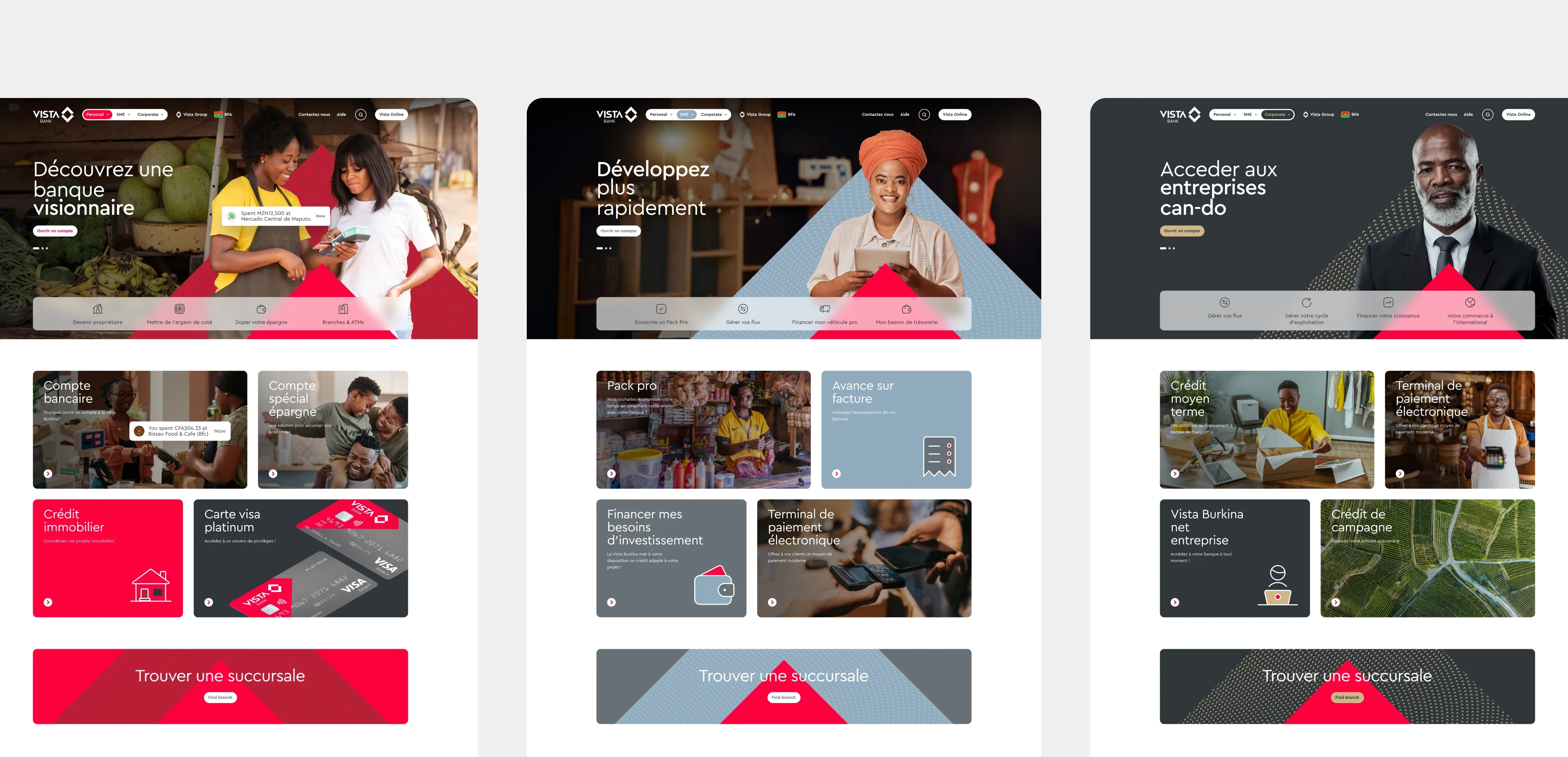
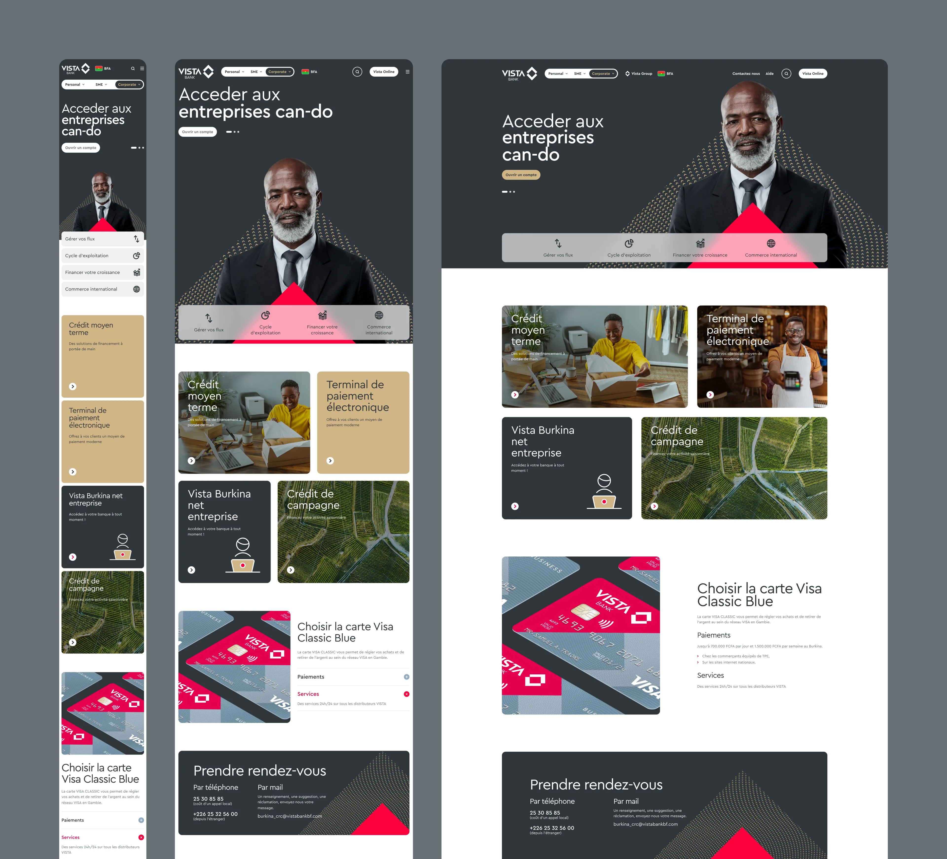
Three banking journeys, one system
Each banking audience — personal, business, and corporate — required a distinct identity without fragmenting the overall experience.
A shared framework ensures consistency in typography, spacing, and interaction patterns, while colour themes adapt dynamically to signal the active banking type. This approach creates clear visual orientation, maintains brand cohesion, and allows the system to scale without sacrificing usability.
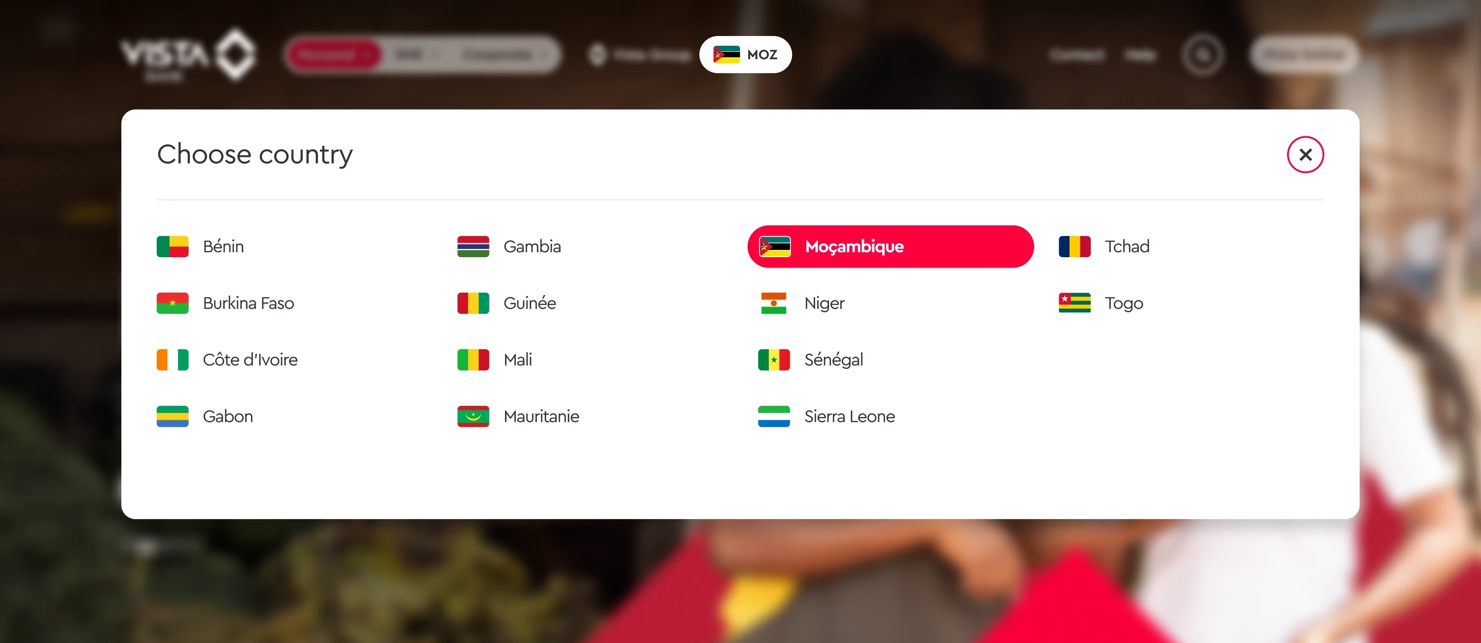
Country selector

Forms and documents hub

FAQs accordion
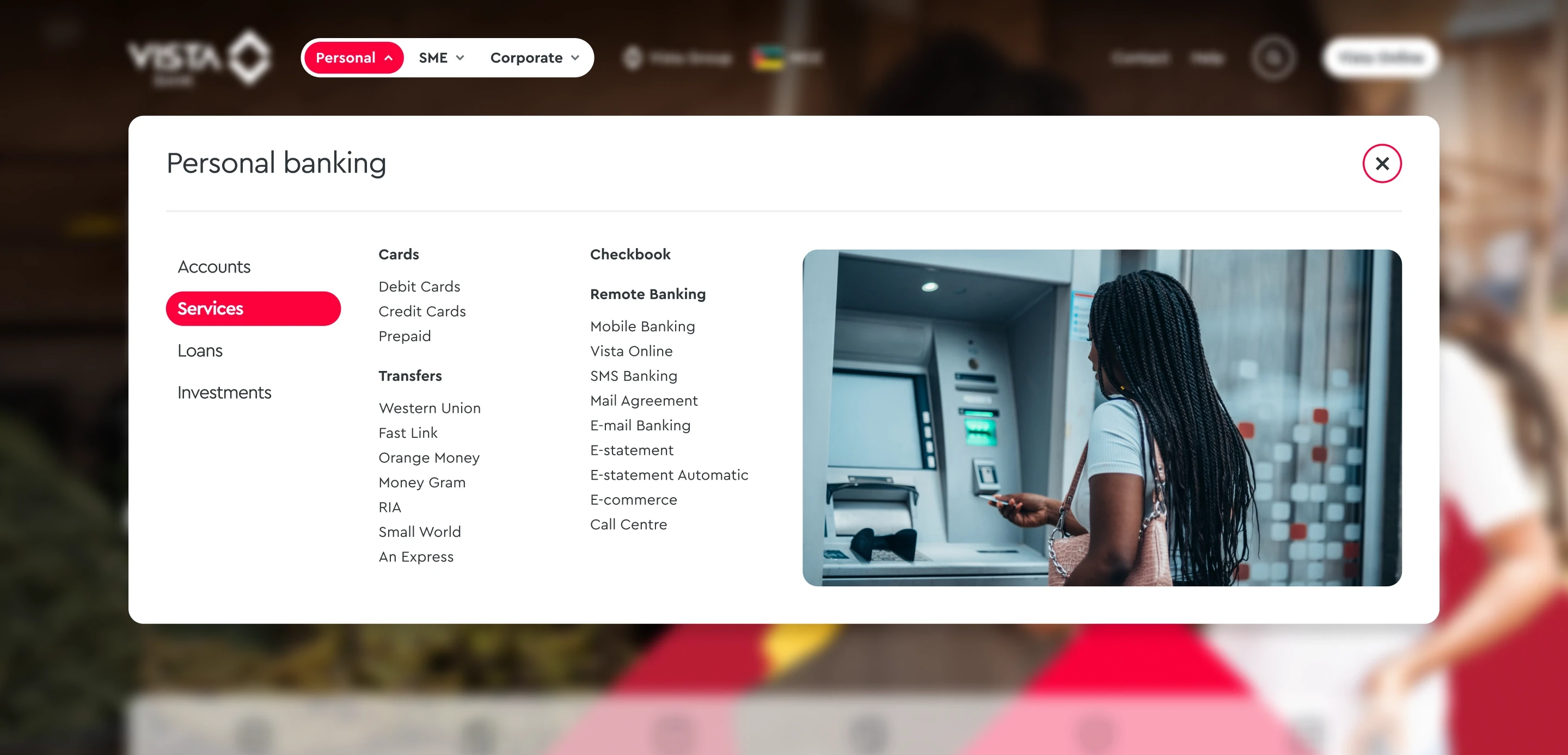
Personal banking dropdown menu with its categories, subcategories, and links

Mobile user flow — Personal banking dropdown
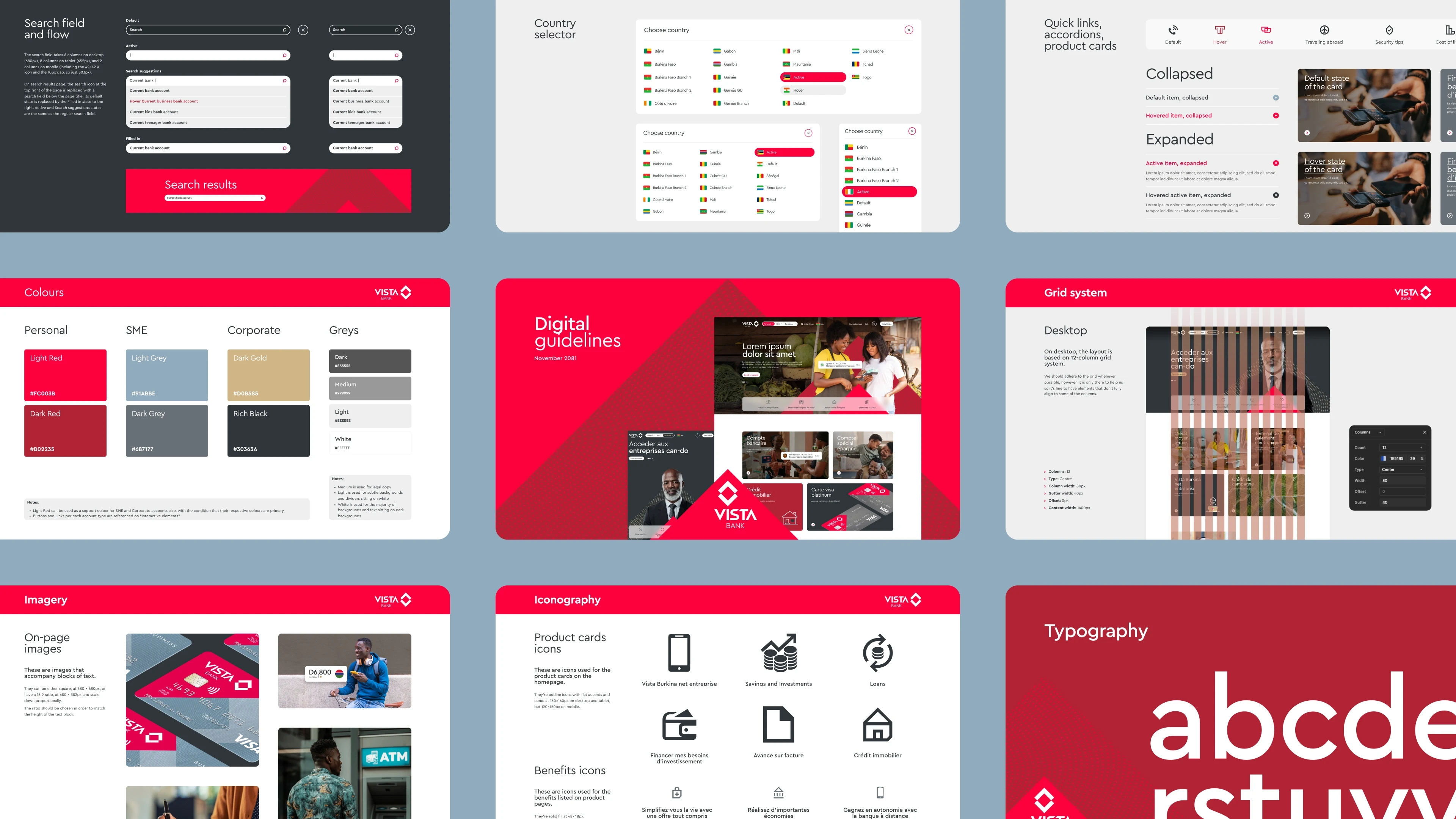
A foundation for consistent design — Digital Guidelines
To ensure consistency across markets and banking segments, the project was supported by a set of digital guidelines documenting the system behind the interface. These covered layout principles, grid structure, typography, colour application, and interactive components.
Instead of relying on one-off decisions, the guidelines capture how the design works so it can be reused and extended with confidence. This keeps everything feeling intentional and consistent, even as the website grows.


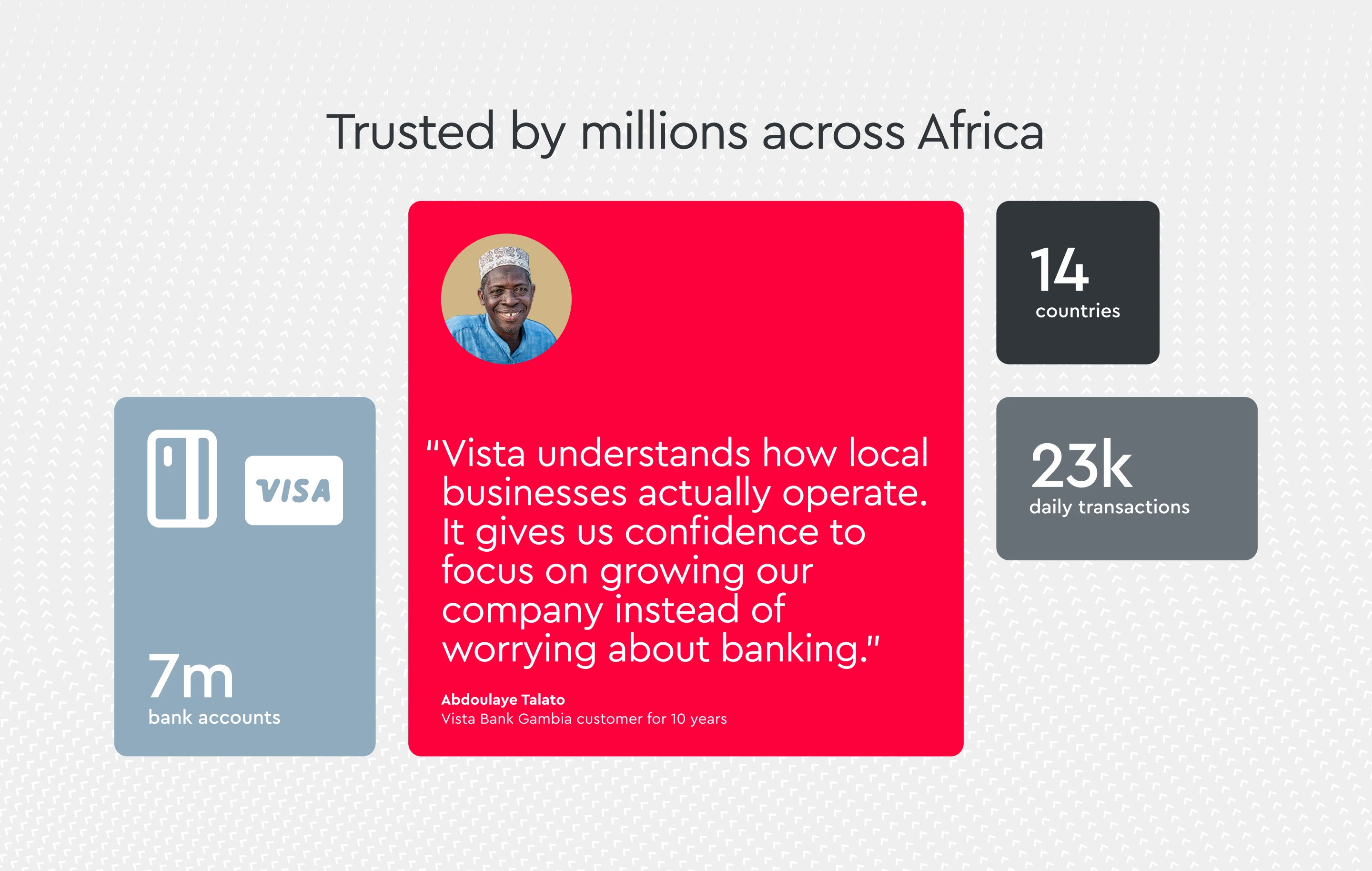
Impact
The redesign established a scalable digital foundation for Vista Bank’s multi-market presence, bringing structure and consistency across personal, business, and corporate banking. By systemising navigation, theming, and design rules, the platform supports future growth faster and more manageable.