
Exploratory motion concepts
To explore how the Starling web experience could feel more expressive and dynamic, I developed a series of motion-led concepts. These explorations focused on hierarchy, pacing, and transitions — testing how movement could reinforce clarity and brand character at scale. I experimented with the homepage as a story that unfolds as you scroll, while also looking at ways to bring motion across key product pages, flows, and interface components.
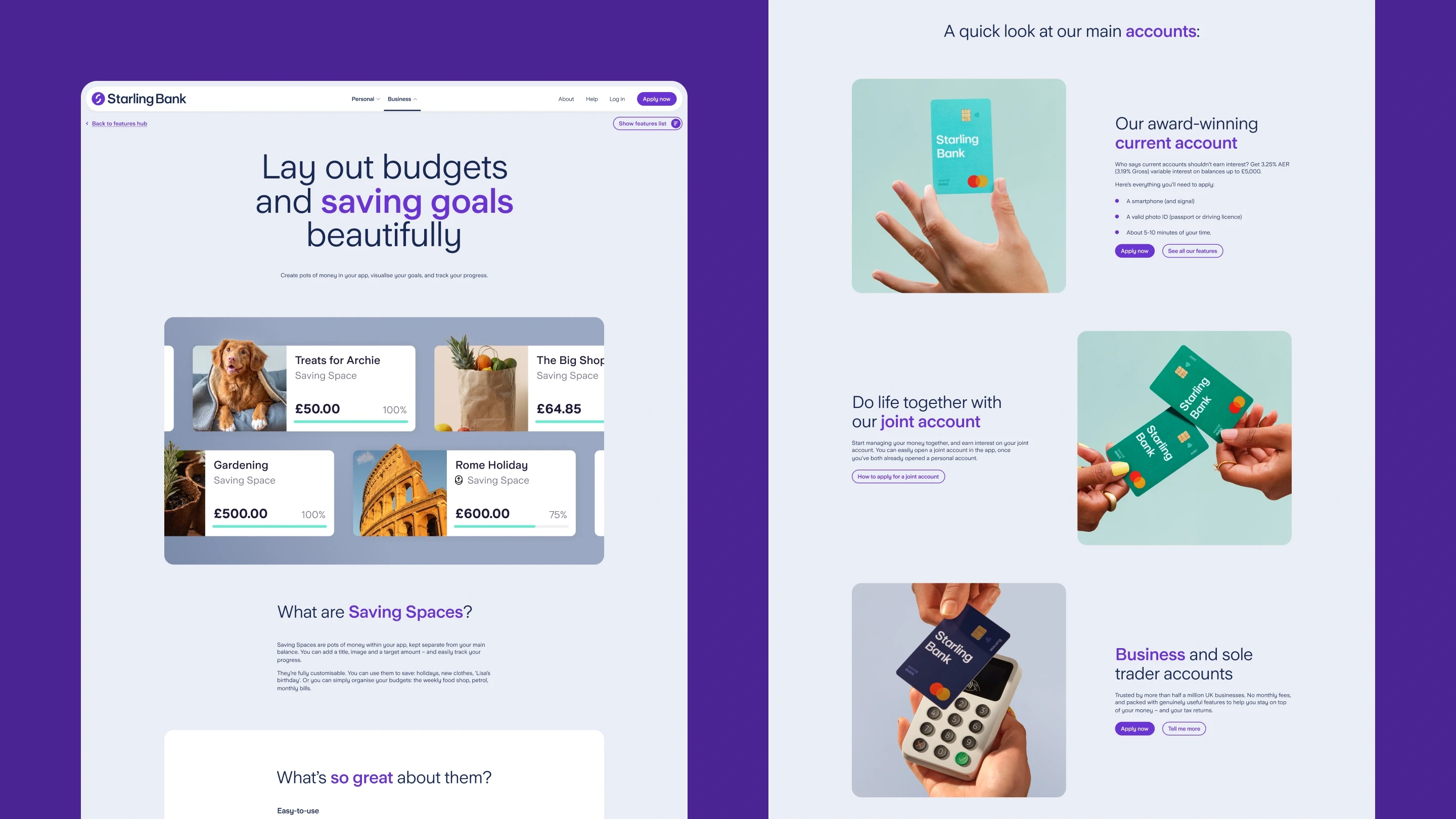
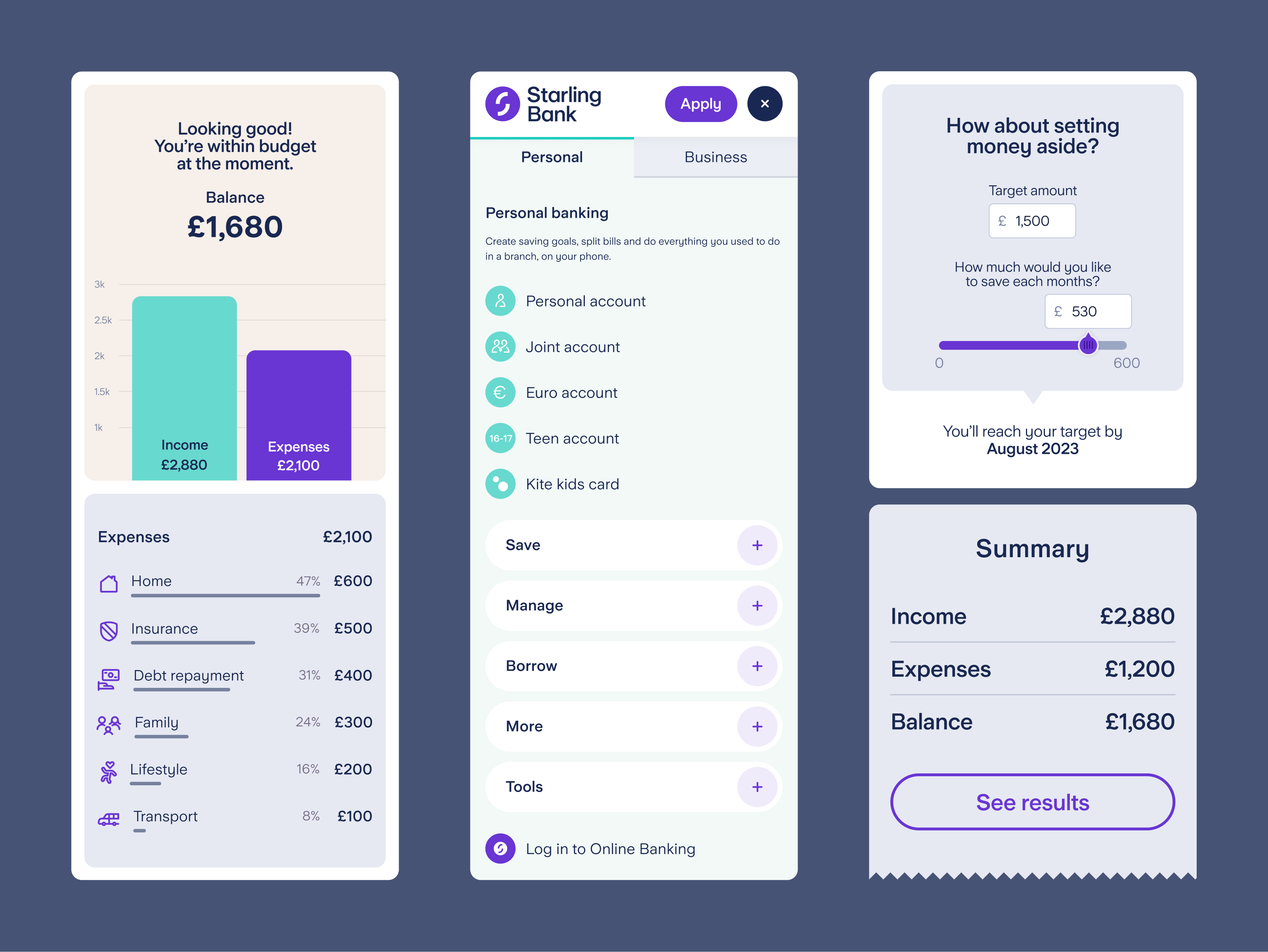
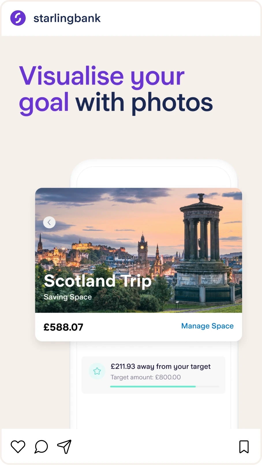
Extending the redesign across the site and social media
The redesign was applied across the full website, applying the new visual language to product pages, user journeys, and modular sections. The focus was on creating a system that felt consistent and flexible in real use — scaling smoothly across mobile, tablet, and desktop while maintaining clarity, performance, and brand character.


Impact
The redesign reshaped Starling’s digital presence stripping back unnecessary copy and letting subtle motion do the heavy lifting, while reinforcing the brand's maturity. User research validated that the experience is clearer and easier to navigate, aligned across all digital touchpoints — both in how it behaves and how it looks.
As Starling’s first specialised digital/web designer, Marius made an immediate positive impact on our web experience. His expertise helped improve user experience through evolving page designs and patterns, contributing to measurable improvements in engagement and performance. He was a strong collaborator and a valued team player throughout.

Gemma Johnson
Director of Digital Growth
Starling Bank