The problem
Inconsistent visual language
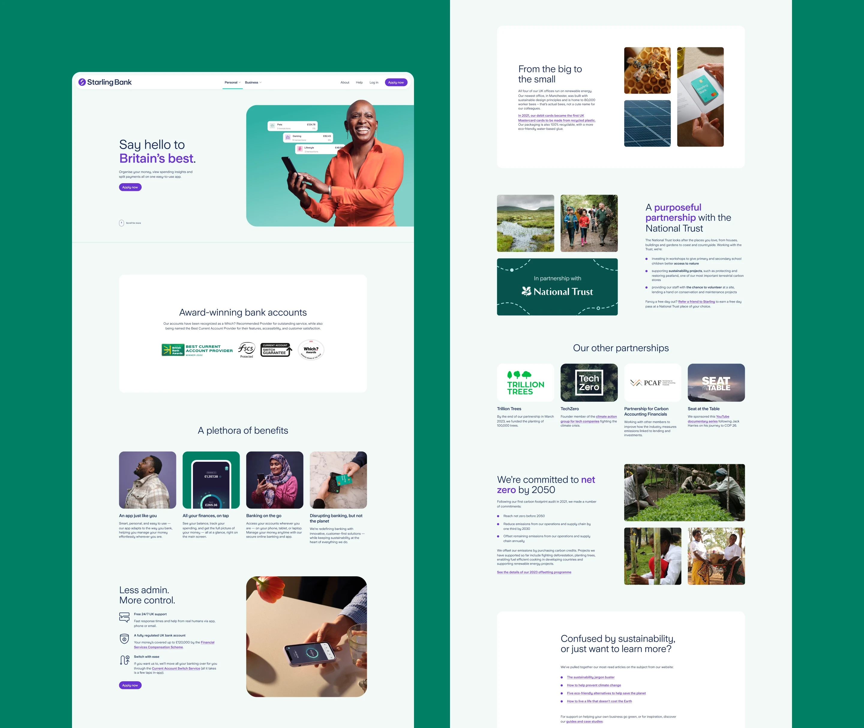
Multiple rebrands and freelance contributions created overlapping design legacies. Typography, spacing, and styles varied not only across the website — sometimes within the same page — but also on social media, email, and other brand touchpoints.
No scale or hierarchy
Font sizes ranged wildly without a defined system. CTAs appeared in a dozen variations, often with inconsistent states and behaviors.
Design ≠ production
Speed often bypassed Figma, leading to a growing mismatch between design files and the live website. Any new work first required reverse-engineering what was actually in production.
Poor UX and responsiveness
Pages were overloaded with copy, breaking layouts across breakpoints and making content hard to scan, read, and interact with.
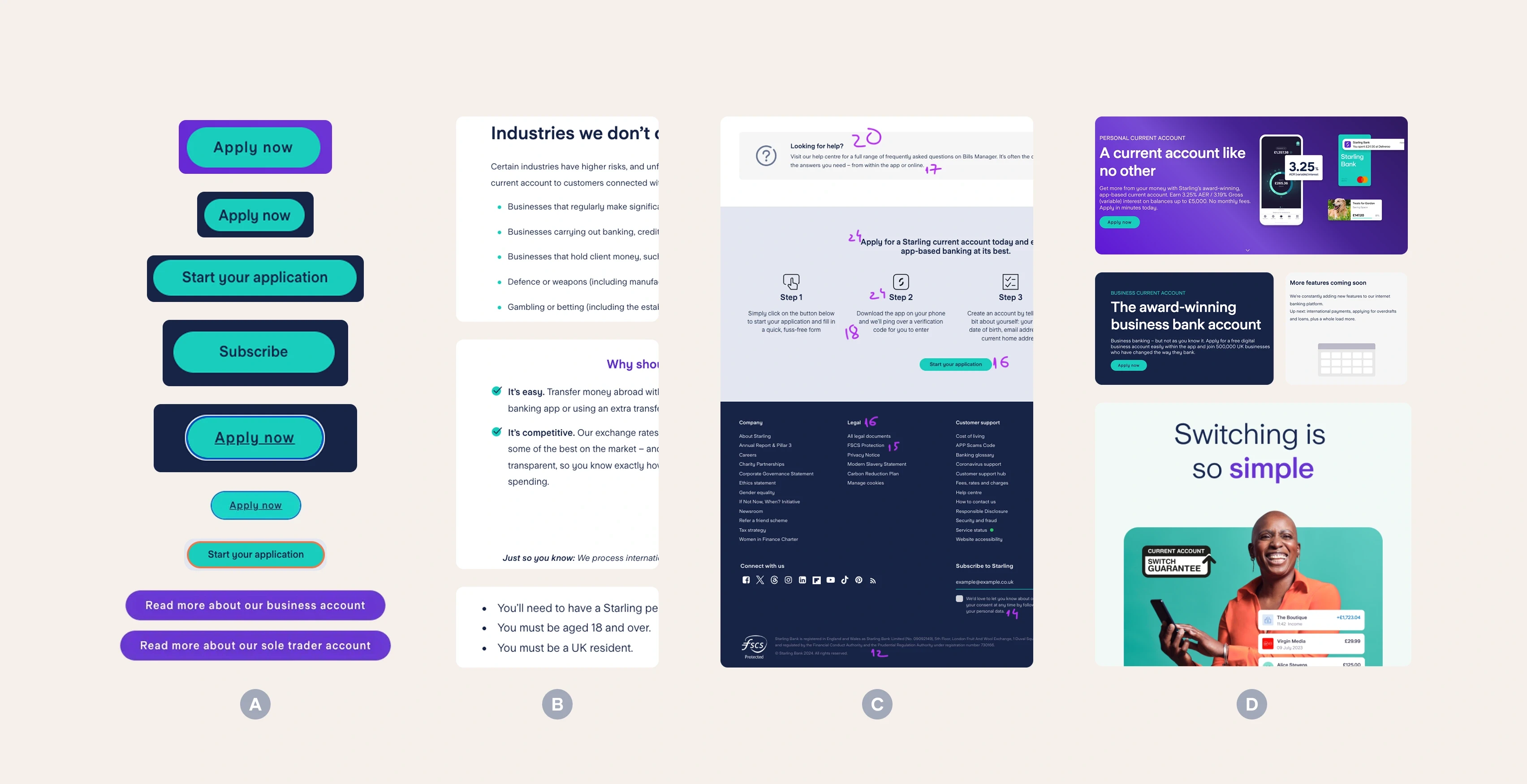
Inconsistent CTAs (A), lists (B), lack of hierarchy (C), mismatched mediums (D)
Goals
Visual & Brand
Establish consistency across the entire website
Define a clear hierarchy and scalable type & spacing system
Fully embody Starling’s latest brand direction
UX
Declutter content and improve readability
Create clearer, more predictable interactions (e.g. forms)
Enable faster experimentation and testing
Engineering
Create a single source of truth shared between design and code
Align terminology between designers and engineers
Reduce one-off exceptions by offering a fixed but flexible set of component variants
Document components and patterns so teams could ship without heavy hand-holding
Design
Increase ROI by improving speed and effectiveness
Reduce repetitive work through reusable components
Enable easy maintenance: edit once, update everywhere
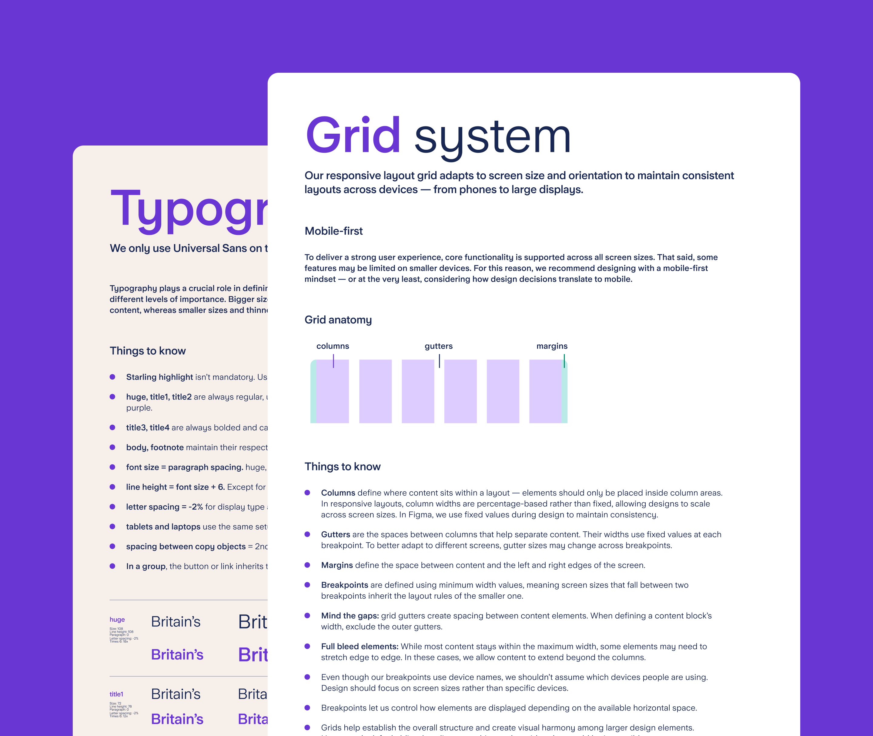
Setting the foundations
Spacing & scale
A 6pt spacing scale was introduced to balance visual rhythm with readability. While 8pt scales are common, a 16px body size felt too small for Starling’s content-heavy pages, whereas 18px provided the right balance.
Primitive spacing tokens were named using a simple numeric convention (1X, 2X, 3X…), where each step represented a multiple of the base unit — for example, 6X equating to 36px. These primitives were then mapped to component-specific tokens (e.g. list-item-gap = 3X).

Colour system & tokens
The Starling palette was defined as a set of primitive tokens and then mapped to semantic, use-case-driven values. This allowed colour decisions to stay consistent while remaining flexible across different contexts.
The token structure followed a clear hierarchy: element → tone → emphasis → state, with only the element being mandatory and the remaining layers applied where needed. Values were defined across three core element groups — surface (fills and backgrounds), border (strokes, dividers, input outlines), and text — allowing scalability without introducing one-off exceptions.

Tokens by reach and specificity

Colour primitive tokens

Semantic tokens anatomy and possible values for surface elements

Component exploration
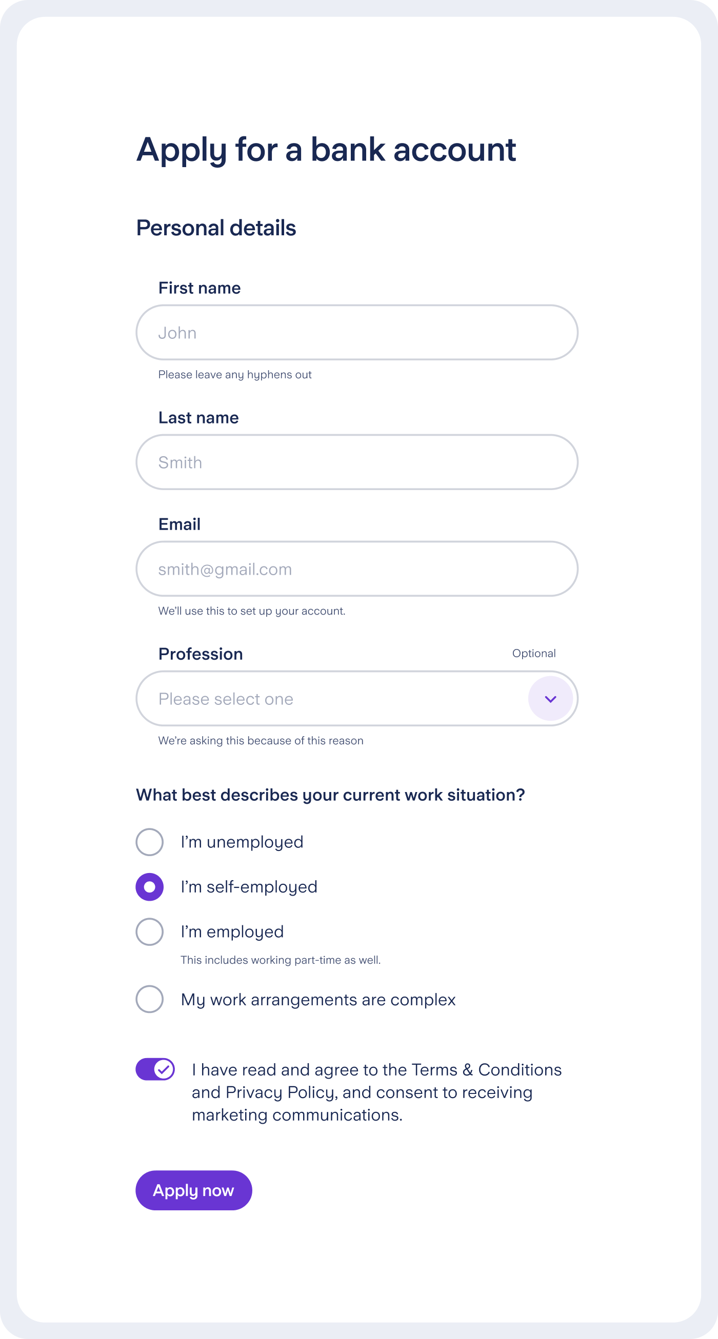
With the foundations in place, core components were explored to find the right balance between flexibility and consistency. Multiple rounds of iteration considered accessibility, responsiveness, and user experience at all times, allowing patterns to emerge before committing to a final direction.
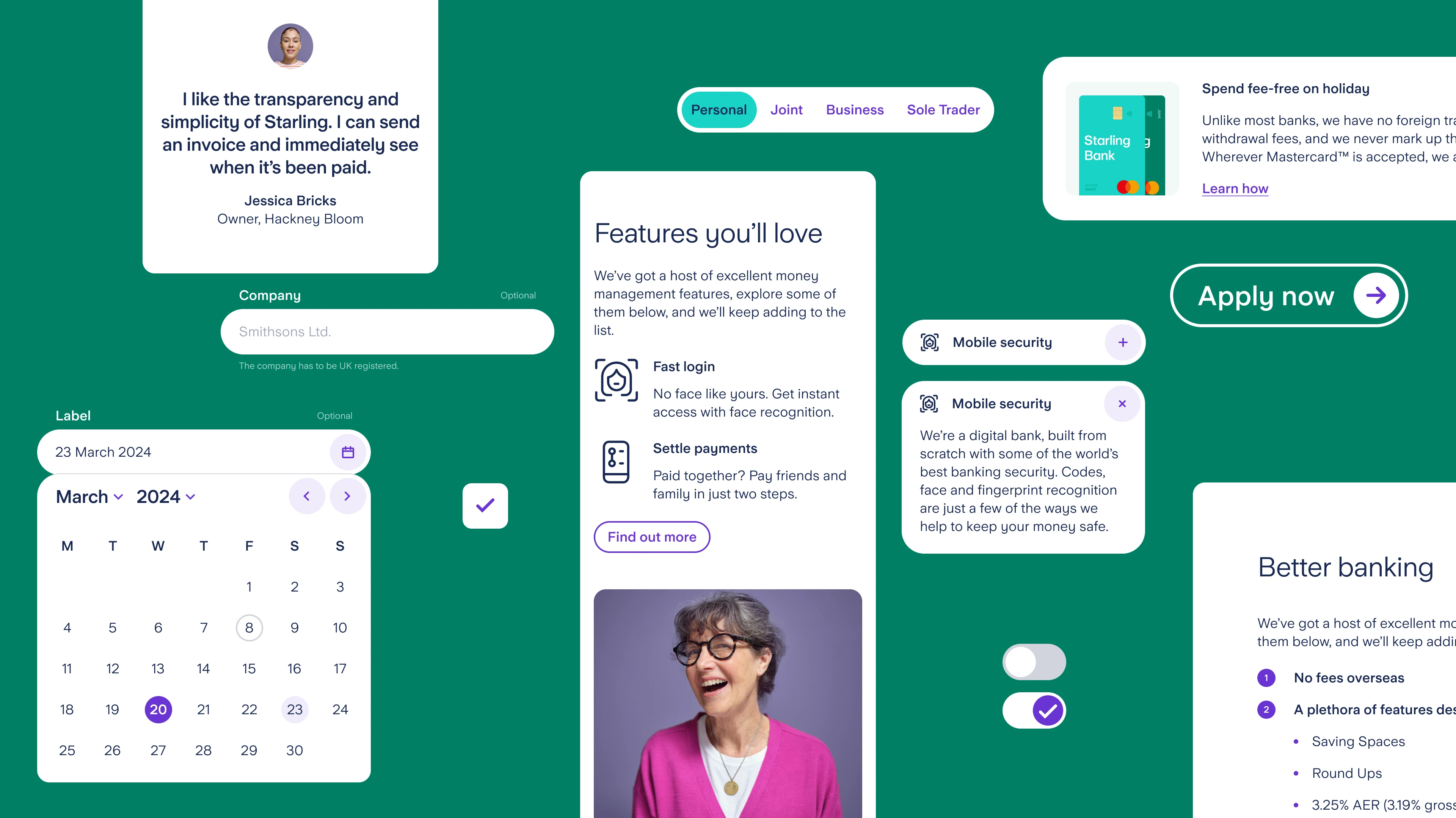

Input states

Input variations

Spacing and sizing following the system’s foundational rules
Systemisation & variants
Once patterns were established, components were systemised into a defined set of variants and rules. Variability was handled through structured properties rather than one-off overrides, making components easier to use, maintain, and scale — while taking full advantage of Figma’s variant and property system.
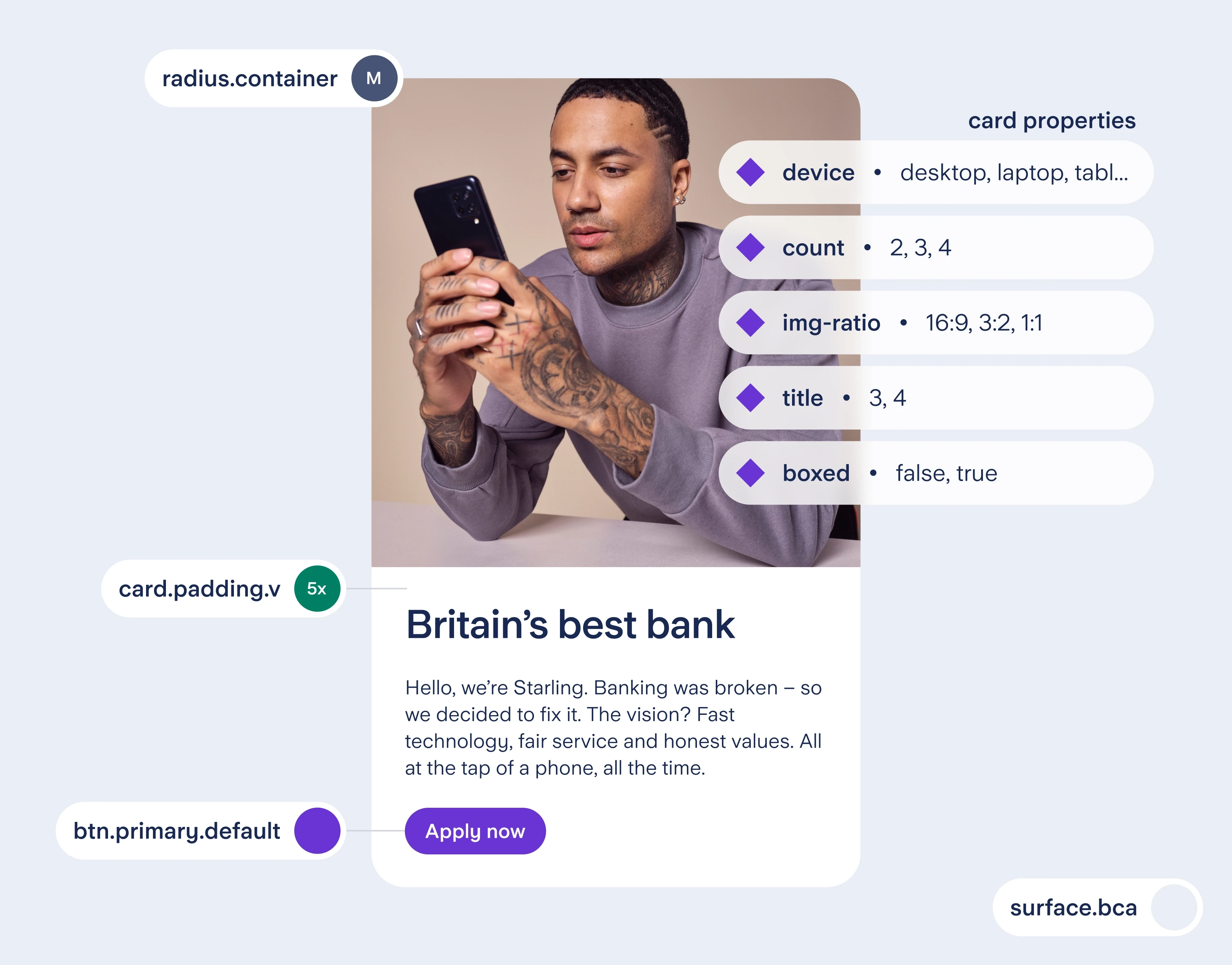
System applied — the Split component
The Split component shows how system rules translate into a scalable layout — pairing structured content with media while maintaining consistency across breakpoints.
Rather than relying on multiple bespoke variants, flexibility is driven by a controlled set of parameters that allow teams to adapt the component without breaking system logic.
In practice, the supported parameters configuration includes:
device (mobile, tablet, laptop, desktop)
order of content and media
list style (generic, positive, negative, numbered, icon-based)
list items count
image ratio (16:9, 3:2, 1:1)


Impact
A system only matters if it changes how work gets done. By aligning structure, components, and documentation, this foundation translated into faster delivery, stronger consistency, and clearer collaboration. The results reflect not just better screens, but a more scalable and reliable way of building product.
Marius' skills enabled us to evolve existing components and develop a new design system, with clear impact seen in improved engagement and performance metrics. He collaborated effectively across teams and was a key driver of design consistency at scale.

Gemma Johnson
Director of Digital Growth
Starling Bank